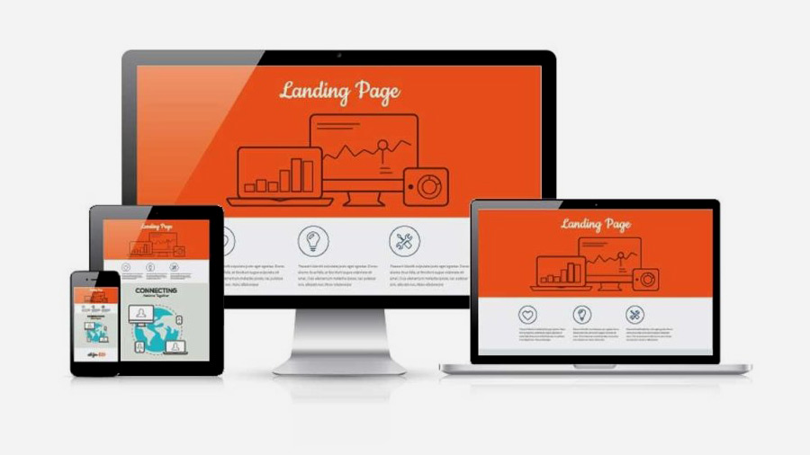
Landing pages are specific pages created specifically for visitors that are referred by marketing campaigns. These pages are designed to achieve a certain outcome. Typically a landing page is intended to convert visitors to a page to customers. This is often done by capturing their contact information in an online form.
Landing page goals are usually to invoke action. Great landing pages anticipate objections by addressing common concerns while not distracting visitors with too much information. The premise is simple but a lot of attention should be paid to layout and design. Effectively use empty space and color to guide your visitor to taking your desired action.
Landing page setup
Setting up the landing page, you should consider your goals for the page, but keep in mind that most people will not convert, but still expect a favorable experience. Make it simple, easy to navigate, and filled with valuable information.
There are a few different types of landing pages, so your next consideration should be which is right for you. One is a landing page that is integrated into your website and consistent with your standard pages and site navigation. The second type is one with a totally different look and feel, that is created for the specific campaign, and it is generally a single scrolling page that has as its main goal capturing contact information. The third type is a microsite that provides information and tabbed pages. Often, successful businesses will use a hybrid strategy and employ different landing pages to meet their objectives. Beyond choosing the format, here are some more tips we think are important for successful landing pages:
- – Integration with the referrer is important. If the user clicks on a link, they expect to see what you offered, so be sure that your landing page is relevant to your referral link.
- – Provide a good experience and excellent content relative to your products or services, and be sure that your content is targeted to the customer that is likely to be reading this page.
- – Be sure your page design is simple and makes the next step easy for users to take. You should include your data capture form on the first page for best results.
- – Use multiple calls-to-action, because some users respond best to images and others text hyperlinks.
- – Limiting page options is effective; grab their attention with a great headline and direct ad copy.
- – Attractive landing pages convert better.
- – Don’t underestimate the psychology of color, and research the right ones for your landing page. Leave enough white space to make your page easy to read and emphasize the elements you want.
- – Graphics can highlight problems (or solutions) and break up the text.
- – Even more effective, video has been shown to increase conversion rates tremendously.
One final piece of advice we have is to integrate Zoho SalesIQ with your landing pages. Zoho offers a live chat software that is easy to add to your landing pages to engage visitors and increase conversions. It also offers real time monitoring, actionable analytics and visitor insights to help you improve your conversions in the future. Get started with Zoho SalesIQ today with a free consultation from Catalyst Group Development.


 19 January, 2026


